Understanding Statistics - Research Methods Part-3
Covers the basic concepts of statistics that are good to know.
Continuation of Part 2.
Frequency
If we have data like : [China, China, India, India], then frequency of this data is [China : 2, India: 2].
Relative Frequency Or Proportion
Using data [China, China, India, India]
The frequency is [China : 2, India: 2]
Total entries : 4
Then Relative Frequency of each entry is :
- China = Total Number Of China Entries / Total Data => 2/4 = 0.5, here 0.5 is the proportion
- India = Total Number Of India Entries / Total Data => 2/4 = 0.5, here 0.5 is the proportion
-
Relative Frequency give you a sense of how much of the whole/entire-set they comprise.
-
All proportions will always be between or equal to 0 and 1.
-
For any frequency table, the relative frequencies should add to 1, this means that we accounted for every observation.
-
For any frequency table if percentages are used then to be relative, they would have to add to 100%.
Percentages
Another way to show relative frequency is by percentage. If we use percentage for Proportion we work with whole numbers instead of decimals/fractions. A percentage is basically a portion, except we multiply it by 100.
Using data: [China, China, India, India] The Frequency is: [China : 2, India: 2] Proportion is: [China: 0.5, India: 0.5] Percentage is: [China: 50%, India: 50%]
Percentages range from 0% to 100% just like Proportion range from 0 to 1. Total of all percentages should add to 100%, this means that we accounted for every observation.
To simplify the above data, we can wrap it at continent level example : [Asia] then the frequency becomes [2+2 = 4], Percentage = [100%].
Bin Size
When dealing with rows of data, we can choose intervals to group them in.
This is called an interval or bin or bucket.
Example:
If we have the age data as [1, 2, 3, 4, 5, 10, 11, 12, 13, 14, 15] We can group it into intervals of [ 1 to 5 ], [6 to 10], [11 to 15] This will create three bins of size 5. Frequency of this data can be written as:
So, the bin size is the interval that you are counting the frequency.
Ages, Frequency
[ 1 to 5 ] , 5
[6 to 10] , 1
[11 to 15] , 5
Histogram
-
It has X and Y axis.
-
Frequency is always on Y axis
-
Variable or Independent Variable is on the X axis In above example variable is age.
-
Intersection of the axis is called Origin Origin cartesian co-ordinates are (0, 0)
-
With histograms, the x-axis should be numerical.
-
With frequency tables, we have exact counts, so we can always create the histogram. But not the opposite way around.
-
With tables, you can add the frequencies in each bin. With a histogram, you don’t always know the exact frequencies.
-
Compared to frequency table a histogram is better for analyzing the shape of a distribution.
Note: In some graphs
-
Independent variable (X axis) is also called the predictor variable
-
Dependent variable (Y axis) is also called outcome
But not in this case of Histogram
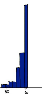
- Question:
Total age data is 50, 4 people are between ge 62 and 70 and 1 person is above 75. Bin size is 5.
What is the proportion of people over 60 years old.
Total People above 60 : 4 + 1 = 5
Proportion : 5/50 = 0.1
What percentage of people are less than 60 years old.
We found out that 5/50 = 0.1 proportion or 01. * 100 = 10% of people are above 60 years Old.
So, 100 - 10 = 90% of people are less than 60 years old.
Note on Bin size
When we create histogram, and we choose our bin size we sometimes sacrifice details for convenience.
For example: if Bin size has ages from 19.5 to 22.5, then we cannot answer exact questions like how many people are below 20.
What should be bin size
We have data ranging from 15 to 105, what should be the bin size if we want to have 10 bins?
105 - 15 = 90. This is 10 bins of size 9 between 15 and 105.
Determining bin width
The x-axis shows that there are 10 minutes between each two tick marks. How many bins (or bars) are there between each two tick marks? The bin width will be 10 divided by that number.
Answer : Since histogram bar size is fixed and there are 4 full bars and 2 half bars, then total is 5 bars between 10 minutes so bin width = 2
What happens when we make bin size bigger
In general when we make histogram bin size bigger the frequency becomes larger because more values will fall inside that bin.
What should we look at to understand student performance
If in a course, the same number of student scored below 75% as above 75% on the final exam.
To understand student performance, we can look at the distribution of final exam scores
Find the point in graph where same number of students scored below 75% as above 75%
You’re looking for a point where summing the heights of all bars to the left gives the same number as summing the heights of all bars to the right.
Bar Graph
Bar graph each entry is a distinct category. Example: People [Europe (10), North America (20), Asia (30)]
- We can put them in any order on X Axis.
-
Order is normally based on what question we are trying to answer. Such as where are the most people from, then we might put it in order from Greatest to Least.
-
Shape of Histogram is very important whereas the shape of the bar graph is very arbitrary.
-
With a histogram the variable on the X axis is Numerical and Quantitative.
- Whereas with Bar Graph the variable on the X Axis is often Categorical or Qualitative.
Biased Graphs
Depending on how the Y-Axis is labelled we can depict the data differently. Meaning a graph with Y-Axis starting from 0 will show values differently from the one that starts from 15. The second one will not have the values from 0 to 14, So this could be used to remove data that is not in favour of the presenter.
Normal Distribution
A normal distribution has one peak called the node
Skewed Distribution
Skewed distributions are the one where most values are towards either left or right of the distribution.
Positively Skewed
Positively skewed distribution refers to the distribution type where the more values are plotted on the right side of the graph
Negatively Skewed
Negatively skewed distribution refers to the distribution type where the more values are plotted on the right side of the graph